


Introduction
TradingView has several types of comparison features. In this article, I would like to explain so that your analysis will be flexible by using these comparison functions of TradingView.
Types of Comparison
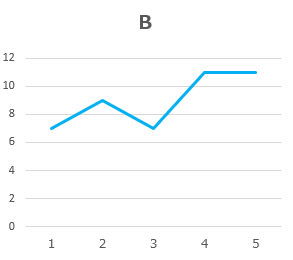
Let’s start with the general comparison. For example, consider the following two charts, “A” and “B”.
If you want to “Compare” these two charts, there are the following methods to compare.

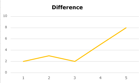
1. Difference
This is the method of subtracting the Y-axis value at the same X-axis value for A and B.
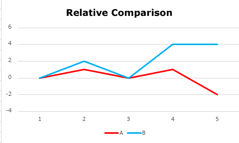
2. Relative comparison
It is a method to see how much it has relatively increased or decreased from a certain point (base point) of the X-axis for both A and B. The chart below shows the increase/decrease from point 1 on the X-axis.
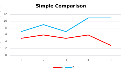
3. Simple Comparison
This is a method to compare the charts of A and B by simply on the same scale on the X-axis and Y-axis.
In TradingView, the above-mentioned second “Relative Comparison” is called “Comparison”, but as the function, all of the above three comparison methods are possible, so I will explain in order below.
Comparison features of TradingView
Difference
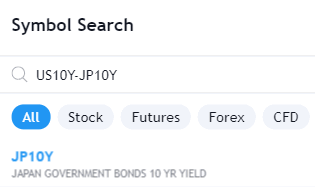
If you want to see the difference between the two values, that is, if you want to display the subtracted value directly on the chart, connect the two symbol name directly to the input field in the upper left of TradingView with connecting by hyphen “-“.
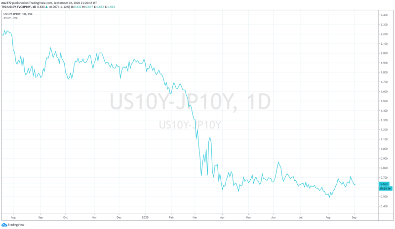
For example, if you want to see the difference between the yields of US 10-year government bonds and Japanese 10-year government bonds, enter “US10Y-JP10Y“.
The chart displayed below is the result.
Relative Comparison
This relative function means “Comparison” function in TradingView.
This is a comparison of how much it has relatively increased or decreased from a certain point.
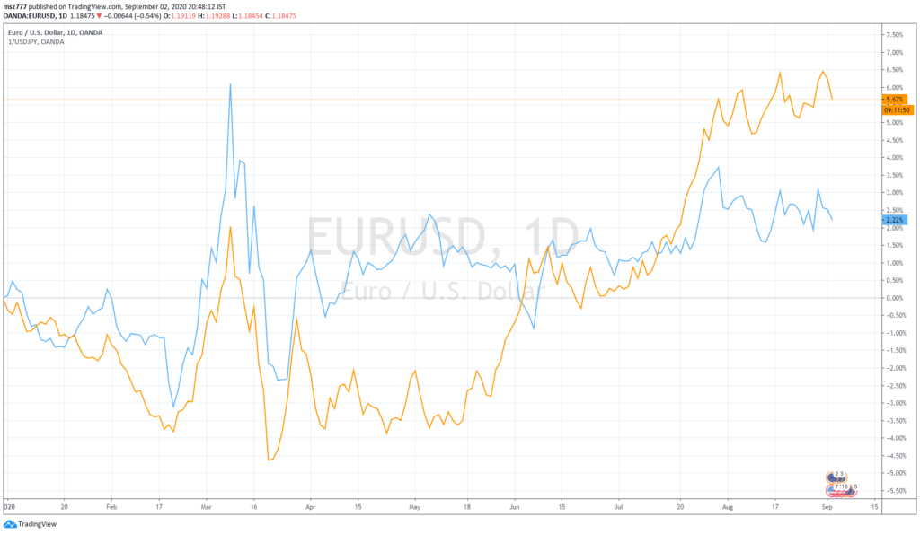
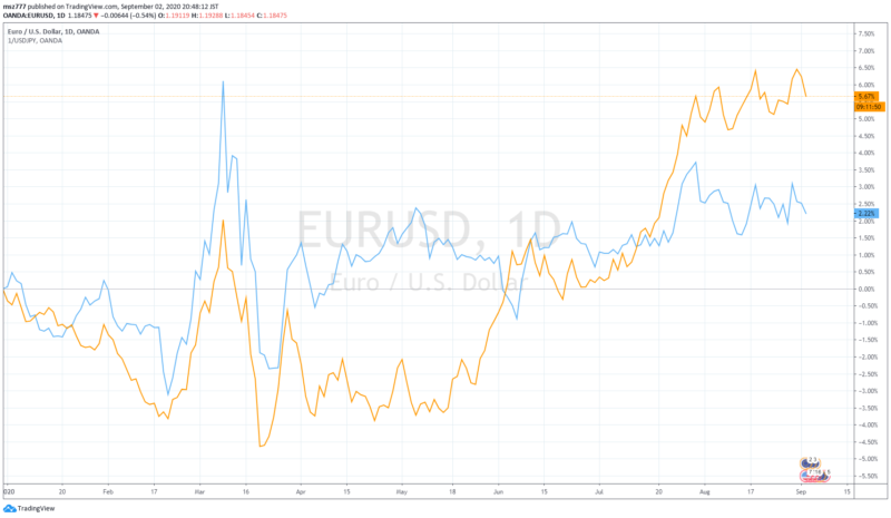
For example, let’s consider “How much USD, JPY, and EUR have changed relatively from the beginning of 2020”.
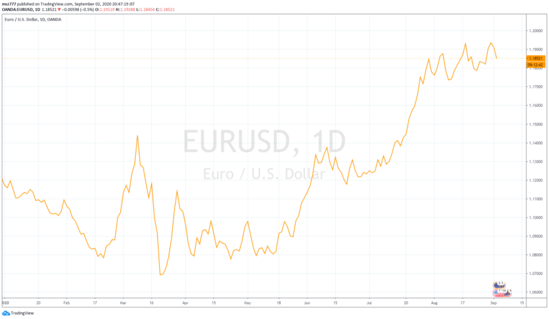
First, show the EURUSD chart. (I have changed from candlestick to line chart.)
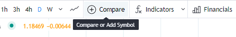
Then click the “+” mark in the top menu.
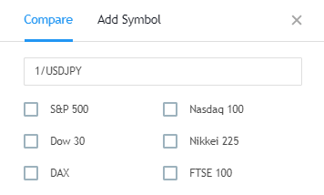
Make sure you select “Compare” for the tab. And enter the USDJPY code in the symbol name input field.
(We want to show USDJPY chart upside down, so enter “1/USDJPY“.)
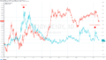
The chart displayed below is the result. The orange line means EURUSD, and the blue line means USDJPY (reversal).
Please notice that the Y-axis scale to the right of the chart was changed to “%” and focus on the 0% line.
Currently (as of September 2, 2020), both EURUSD and USDJPY (reversal) are above the 0% line, so both EUR and JPY are stronger against USD since the beginning of 2020. Especially EUR is relatively stronger. You can change the base point of the X-axis by sliding the X-axis below the chart.
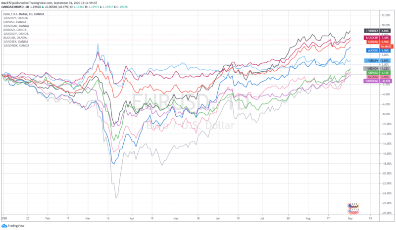
This comparison method is effective for exchange rates. As an example, I compared all 10 major currencies called “G10 currencies” from the beginning of 2020 as follows.
 Please refer to another article as follows.
Simple Comparison
Next, the simple comparison below is used when you want to simplify show charts with the same scale. In TradingView, this is a function that simply overlays a chart of two values on the same scale of chart, which is called “Add Symbol“.
The point is to choose whether to align the Y-axis scale. (This point is very important)
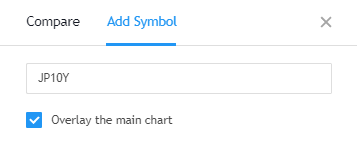
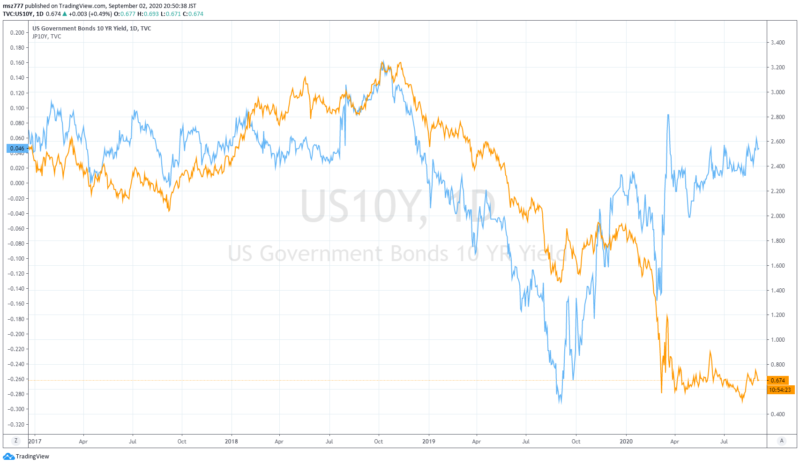
For example, if you want to simply compare 10-year US government bond yields with 10-year Japanese government bond yields of Japan, show the 10-year US government bond yields of the US and click on the “+” mark in the upper menu.
Now select “Add Symbol” in the tab above the dialog.
You can leave tick-mark of “Overlay the Main Chart” as it is. Enter the 10-year Japanese government bond yield code (“JP10Y”) here.
The chart displayed below is the result. The value of year after 2017 is displayed.
The US 10-year government bond yield scale is shown separately on the right Y-axis, and the Japan 10-year government bond yield scale that we chose later is shown separately on the left Y-axis.
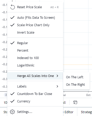
So, the very important point is to click on the left Y axis and select “Merge All Scales into One“. (You can choose “On the left” or “On the Right”.)
The chart displayed below is the result.
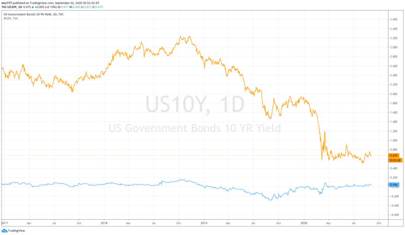
Now you can properly compare the yields on the government bonds of both countries.